Project Description (500 words)

The project that I have been developing throughout this term deals with concepts of identity and data sharing on the Internet. Specifically, these concepts relate to issues of control of identity, persuasion and privacy. According to Rose (1999), identities are not chosen freely, but are intensely governed, in other words, we are being directed on how to behave and act, which makes our identity heavily disciplined. This is specifically seen in the way that we are persuaded to constantly share personal data of our online lives which are then sold to advertising agencies in order to then ‘be coerced into buying something online’ (Morozov, 2011, p. 229). This persuasion and control of identity occurs because ‘the Internet was built in such a way that [its] functioning mechanisms remained a mystery to the audience’ (Zielinski, 2006, p.138). However, the sharing of data poses a serious ‘risk to the security and privacy of our identities’ (Nurse, 2015) as ‘we (and our devices on our behalf) are leaking oodles of sensitive identity information, and others are listening’ (Nurse, 2015). This project thus incorporates these theories into one website that aims to raise awareness of these issues.

These theories are incorporated within the website in the form of a personality quiz that users will be coerced into taking. The aim of the project is to embark the user on a seemingly innocent journey of self discovery by asking them questions which seem trivial at first and then get more and more personal as the user progresses through the website. However, once the user finishes the last question, instead of getting a result the user will go to this page. A man with an error message will slide in and claim that something went wrong, alluding to the fact that the information that was just given away by the user is lost. This will serve as a reality check  because the user will realize that they have just shared personal information on an unverified website and now they have no knowledge of where their information has gone or who has access to it.

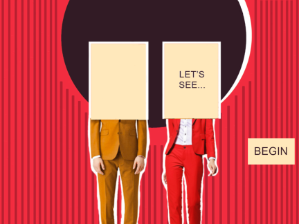
The pilot material contains 4 pages from the quiz, the landing page, the home page, one quiz page and a final page. The first two pages are completely finished while the last two pages are partly animated mock-ups which are included into the pilot material to provide a stronger sense of narrative of the website. These pages will portray a sense of how the website will look upon completion.  The larger project to which the pilot relates will portray the final website design with all the developed pages with questions of the quiz. It will have the same aesthetics and inhibit the same qualities but will be more developed.

The project is aimed at the Generation Y group or the Millennials as they are the first generation to have grown up exposed to the Internet. Thus, ‘their wide and prevalent use of the internet, combined with their distinct position of growing up exposed to advanced technology, makes Generation Y a unique target for companies’ (Djamasbi, Siegel and Tullis, 2010, p.309). This is why they are the most likely to be targeted to give away personal data through the persuasion tactics implemented by advertising companies. Additionally, ‘Generation Y actively contributes, shares, searches for and consumes content – plus works and plays – on social media platforms’ (Bolton et al., 2013, p.246). Thus, my project will be shared on social media platforms such as Facebook and Twitter which are used the most by my target audience.

Bibliography:

Bolton, R., Parasuraman, A., Hoefnagels, A., Migchels, N., Kabadayi, S., Gruber, T., Komarova Loureiro, Y. and Solnet, D. (2013). Understanding Generation Y and their use of social media: a review and research agenda. Journal of Service Management, 24(3), pp.245-267.

Djamasbi, S., Siegel, M. and Tullis, T. (2010). Generation Y, web design, and eye tracking. International Journal of Human-Computer Studies, 68(5), pp.307-323.

Morozov E. (2011). What do we think about? Who gets to do the thinking? In: Brockman, J. ed. Is the Internet changing the way you think?. New York: Harper Perennial, pp. 228-231.

Nurse, J. (2015). Exploring the Risks to Identity Security and Privacy in Cyberspace. XRDS: Crossroads, The ACM Magazine for Students, 21(3), pp.42-47.

Rose, N. (1999). Governing the Soul, The Shaping of the Private Self. London: Free Association Books.

Zielinski, S. (2006). Deep time of the media. Cambridge, Mass.: MIT Press.

Navigation, Narrative and Submission Website Pages Explained

Navigation Map:Screen Shot 2016-12-04 at 2.54.19 AM.png

The above map shows the navigation of my final website as well as allows to see the narrative that has been created. For this submission, I am only turning in 4 pages, 2 of which are mock-ups. This map also shows exactly how the user will navigate through my website. Additionally, for the purpose of this map, only 7 questions are displayed, however, there will be 10 questions in total in my final project. As mentioned previously, my website doesn’t have a menu which means that the user will not be able to go back once he clicked to go to the next page. This was done in order to  make sure that the user follows a specific journey because if the user had the option to choose which section of the quiz he could go on, then the narration would be ruined. Thus, the order of everything within the website is extremely crucial for the desired effect.

Landing Page:

Screen Shot 2016-12-08 at 15.54.26.png

This is the first page of my website. I created lines and animated them in a way that makes the letters look like they are assembling in front of the user. This was done with the aim of making the user aware of the medium.  This aesthetics thus simulates an almost raw/ behind-the-scenes type effect which makes it look like you’re getting a glimpse into how websites are usually created before they are shown to the public as already assembled with hight quality graphics that attract the attention of user.

‘Lets play’ button- This button was inspired by an online quiz that I clicked on. I really like how that sounds very playful and fun and I thought that it goes perfectly well with my game inspired-design.

Home Page:

Screen Shot 2016-12-08 at 15.54.53.png

This is the home page of the website. The page as well as the whole website uses a vintage design aesthetic. As discussed earlier, vintage design can ‘elicit a sense of history, of stability, of reliability, and of value’ (Yoder et al., 2016).  When combined in a website, this concept evokes a level of trust from the users towards the website. Additionally, the lines behind the figures as well as the animation of the figures sliding in, all act as a source that evokes the awareness of the user towards how the medium is constructed.

The fact that the faces of the figures are covered directly relates to the concepts of blurring the face as representation of the fact that our true self is irrelevant online and that we are simply just an ‘IP address’ used in order to be persuaded into purchasing something online. The covering of the face is also a visual representation of how identity of the users on the Internet is being manipulated.

I also created a conversation between the figures and the user. This reinforce a game-like quality of the website and also serves as a source of attention-attraction for the user as the conversation will keep them entertained. This was created after the Lecture by Erica Scourti in which she talked about the existence of intimacy between a person and their computer, which generates a level of trust between them. Thus, this interaction is supposed to evoke a sense of trust in the user, making him want to think of my website as reliable and thus, engage in sharing of personal data through the questions.

Quiz Question Page:

Screen Shot 2016-12-08 at 15.55.05.png

This is the mock-up of the quiz question. The quiz seem like it is initially asking for very trivial information, something that people don’t mind sharing as it isn’t anything personal or seemingly harmful. However, as the user progresses through the quiz, the questions will become more personal and will require the user to think more critically about the medium while simultaneously giving away a little more information with each following step.This will make them give away personal information/data and reveal the fact that people’s identity online is constantly being controlled and governed using similar persuasion techniques.

This page will also have animated lines coming into the page as the user goes on the page which will follow the tactic of making the user aware of the medium.

Final Page:

Screen Shot 2016-12-08 at 15.55.14.png

This is a mock-up of the last page of my website. Once the user finishes the last question, instead of getting a result the user will go to this page. A man with an error message will slide in and claim that something went wrong, alluding to the fact that the information that was just given away by the user is lost. This will serve as a reality check  because the user will realize that they have just shared personal information on an unverified website and now they have no knowledge of where their information has gone or who has access to it.

The ‘okay’ button appears a couple of seconds after the figure and when clicked, a statistic will appear in the final project which will reveal the educational quality of this website as it will make them aware of the concept of data sharing based on how easily they give away their personal information/data.

Bibliography:

Yoder, W., Baker, C., S., A. and R., T. (2016). Vintage Designs For the Modern World – Logoworks Blog. [online] Logoworks Blog. Available at: http://www.logoworks.com/blog/vintage-designs-modern-world/ [Accessed 3 Nov. 2016].

Submission: Why did I choose to animate these 2 pages?

For this term’s pilot material submission, we are supposed to submit 2 web pages. These two pages are supposed to serve as a snippet into the navigation and narrative of my final website. Thus, I have been working on completely finishing these two pages and also creating mock-up plans for the other pages of my website.

I think these two pages are the most appropriate choice for this submission because they are basically the main focus of attraction to my website. By introducing the concepts of the quiz, these two pages capture the attention of the viewers while at the same time intriguing the users enough for them to want to see what the quiz is actually like.

These pages are the first thing that my users will see in my final website and since my target audience is people in the Generation X, their general interest in a website is based on the first impression that they get because they have a ‘short attention span’ (Djamasbi, Siegel and Tullis, 2010, p.310). This is further reinforced by a statement that ‘even major usability flaws on a website can be overlooked based on an extremely positive first impression’ (Djamasbi, Siegel and Tullis, 2010, p.308). This accentuates the fact that the initial two pages are vital as they determine whether my target audience will remain on my website. Moreover, ‘there is evidence that the visual appeal of the homepage may be particularly important to Generation Y’ ((Djamasbi, Siegel and Tullis, 2010, p.309). This once again reinforces the importance of these two pages and also acts as a supportive statement to why I chose these particular pages.

The reasoning behind my selection of these two pages could also be explained in terms of presenting a possible project to a board of directors or buyers in a creative industry. If I was going to present my project, I would only provide a snippet of the project itself and I would use the pages that introduce my idea, pages that have the most visually interesting qualities in order to capture the attention of the viewers by making them interested in what the website will be about.

UPDATE: I have decided that I will also include 2 mock-up pages on in the pilot project submission to provide a stronger sense of narrative of the website.

Bibliography:

Djamasbi, S., Siegel, M. and Tullis, T. (2010). Generation Y, web design, and eye tracking. International Journal of Human-Computer Studies, 68(5), pp.307-323.

Change in Animation on Landing Page

The animation that I had on the landing page consisted of two animation files that played right after each other. The first animation assembled into a letter H while the second one appeared seamlessly after the first one and made the letter smaller and moved it to the top of the page which was then followed by the rest if the words of the question. However, after showing my pilot website in class, I was recommended to remove the section where the letter H gets smaller and moved to the top corner. From the feedback, I learned that the assembling of the letter part looked professional while the movement of this letter that followed looked distracting and too abrupt. I completely agree with the comments as I myself have been struggling a little with making the two animations flow together. Thus, I decided to work on that particular aspect of the animation.

It is hard to see but the slideshow below was the initial animation that I used.

This slideshow requires JavaScript.

By experimenting with and tweaking the Adobe Edge file, I managed to change the animation. The animation on the landing page now assembles the letter H, disappears and then the whole ‘How’ word appears in the top corner, followed by the rest of the words in the question. Thus, I removed the transition and now made it more clear and I think it words much better visually as the space between the two animations allows the eyes to concentrate more and made the general effect of the animation on this page better.

The slideshow below shows that the word appears all together right away.

This slideshow requires JavaScript.

Additionally, I have also received feedback that the H looks more like a logo rather then an introduction to my quiz. I haven’t really looked at it that way before but now that it has been pointed out to me, I think it would interesting to experiment with the landing page next term and maybe make the beginning letter of each word assemble together? I have made a mock-up of how that would look (image below). I think that this could potentially make the page too busy so this might seem too distracting to the audience, however, I think that this could also work if done right. Thus, I think next term, I will try and experiment more with the animation on the landing page.

screen-shot-2016-12-08-at-15-28-17

Budget and Exhibition of Work

I thought that in order to make my project stronger and more successful in the future, I needed to consider the budget of my project as well as how I would exhibit and spread it.

Since my current budget is 0. I know that I wont be able to promote my project through any methods or services that involve spending money. However, I think that spending money might not even be necessary because ‘Generation Y actively contributes, shares, searches for and consumes content – plus works and plays – on social media platforms’ (Bolton et al., 2013, p.246). Social media platforms are therefore central to the spread of my website as I still accomplish the results I hope to acquire through sharing my website on social media sites such as Facebook and Twitter. Additionally, sharing my website on social media is relevant because they serve as central platforms for oversharing data, thus, by placing my project exactly where the oversharing of data occurs, I could educate the target audience directly. Additionally, I currently have a website domain that I have been using for the past couple of years. Thus, I could also share this website on my domain and distribute this awareness through a platform designed for websites.

Bibliography:

Bolton, R., Parasuraman, A., Hoefnagels, A., Migchels, N., Kabadayi, S., Gruber, T., Komarova Loureiro, Y. and Solnet, D. (2013). Understanding Generation Y and their use of social media: a review and research agenda. Journal of Service Management, 24(3), pp.245-267.

Home Page Animation- Font

fancy-font
gif

So far, throughout the visual and conceptual development of the website, I was playing around with various different fonts but I haven’t really made a consistent final choice. I mostly discussed what the text will say rather then what it will look like.  I thus decided to make a separate post where I explore the two prevalent fonts that I have considered including in my website. Initially I used a font that I have previously downloaded online called basic title font. I have used it throughout all the experimentations of my website because I liked how it looked visually and I think it complemented the vintage-like aesthetics of my website. However, when I started thinking about the significance of this font, I realized that I should use a font that has a more conceptual significance in relation to my theme. Thus, I started doing research and found out that the font Arial is ranked as font number one as it is used the most online. Additionally, according to the statistic below, this font is used on 604,158 sites! This means that it is the font that my target audience is used to seeing the most online. I thought that using this font could act as a reinforcement of the persuasion quality of my website because it will simulate their experience on a ‘trusted’ site such as google.

Screen Shot 2016-12-05 at 11.53.42 PM.png

Source of Statistic and Information:

Home


Home Page Animation

My initial plan for the animation was that the two figures will come into the website as soon as the user goes on the page. Then I wanted to create buttons that would appear and the user could click on in order to make the figures in the page ‘speak’ to the user. I thought that having the user click on buttons will make the website more interactive. Thus I started experimenting with creating responsive buttons on Adobe Edge. I decided to use Adobe Edge Animate as it has more interactive possibilities. The hardest and the most interesting part of this whole process was learning  Javascript coding in order to make my buttons responsive. I watched multiple tutorials on youtube and it was really complicated at first because it was hard insert a code on the buttons that would make the text visible one at a time, depending on what button was clicked. I couldn’t get the animation right at first but after a while I started to finally understand how it all works and I managed to create the animation that I thought I wanted to include in my website.

The below images are screenshots of my process of creating the animations for this page.

click-1

click

I wanted to play with the code in order to make responsive buttons that would appear one by one in order to display different part of the conversation between the user and the figures. Another complicated part was that I had to make sure that the ‘click’ buttons become visible one at a time and that two buttons would not be visible at the same time as I thought that will confuse the users. I thus, had to input various ‘Click’ buttons on the circle around the figures and make sure that a button goes invisible once clicked and then another button would appear, revealing more of the story. Despite the fact that I managed to achieve that in the end and I was very happy that I got to play around with the code which allowed me to get more familiar with the capabilities of Adobe Edge, I didnt end up liking the effect that was created. I mentioned earlier that next term I would like to also allow the users to animate parts of the figures themselves by displaying ‘click me’ buttons. Separately these two effects might look interesting, but together they look too messy and confusing and I think they would disrupt the flow of the website and make the users loose their interest.

Thus, I decided to just make a simple gif animation for the conversation part of this page. This will allow me to add interactive movement of the figures next term, which will appear as ‘click me’ buttons after the gif text finishes playing.

screen-shot-2016-12-04-at-2-41-00-am

I was overall very pleased with the result of this page and Im happy that I experimented with new features of Adobe Edge. Even though I didn’t end up using the coding that I learned, I still feel like I could apply this knowledge next term if I decide to create responsive buttons to any of the pages. I could also apply these skills that I have gained in my career in the future. If I ever need to create an animation for a company that I’m working for, I could use my existent knowledge to produce something even better.

Additionally, in the lecture with John Marchant, he highlighted that not following conventions could create an interesting effect. I thought that my website will not have a menu which in a way relates to his point of not following conventions because typically, websites have a navigation menu. Thus, by making the choice not to include a menu, I am forcing the user to follow a specific path and because the user cant go back and forth between the pages, he/she will have to stick to my navigation plan. Additionally, not including a menu was done in order to  make sure that the user follows a specific journey because if the user had the option to choose which section of the quiz he could go on, then the narration would be ruined. Thus, the order of everything within the website is extremely crucial for the desired effect.

Visit to Tate Modern Museum

This weekend we decided to go to London and visit the Tate Modern Museum in hopes that we will find some inspiration for our project in order to make it more critical both visually and theoretically. The pictures below are some of the pictures that I took at the museum. I was specifically interested in the ‘media networks’ section at the museum which looked at some of the ways in which artists responded to the impact of mass media and the changing technologies that shape our world.

img_8520img_8525img_8505

Work that related to my project:

Sue Williamson –

The above images were created by Sue Williamson. Each central image was photo-etched with additional elements rendered in hard-ground etching, aquatint or hand-drawing. Additionally, a decorative colored border surrounds each portrait. These images reminded me aesthetically of my project as they have a collage-like look. They also incorporate a similar color palette to the one that I have been experimenting with a myself which is something that I was happy about as I really liked how these colors worked together.  Williamson used old photographs along with colored elements around the images, these elements gave them a completely new appeal which I think worked successfully in this context. Rather then just evoking nostalgic feelings of the past, she managed to make them look modern and relevant once again. I am very happy that I saw these collaged images and I think these will be beneficial when i’m finalizing all the elements on my website. Maybe ill even try and incorporate some of the above colors that I haven’t used yet?

Hito Steyerl –

mu_hito-steyerl-how-not-to-be-seen

This installation is titled – How Not to Be Seen: A Fucking Didactic Educational .MOV File 2013 which according to the description, borrows the format of an instructional video. It explores today’s ‘world made of pictures’ and how and why we might hide within it. Additionally, the narration of this installation gives strategic advice on how to become invisible. Her work addresses recent developments in the way digital images are created, shared and archived. Even though her work mainly refers to the disappearance of political radicals, I think that it could relate to my website as the concept of not being seen could be applied to a way to avoid oversharing data online. Just like her project, my own project in the future could also have educational qualities that teach people how to avoid sharing data online and thus, how to avoid being targeted by advertising agencies.This will then help people feel liberated in an oppressive environment. Additionally, the description said that her work balances criticism and humour which correlates exactly with the approach that I have been wanting to implement into my websitete. I think humor is a good tool to implement as it captures the attention of the users to a greater extent. Thus, just like there were people watching this video who’s attention was captured by the humour factor, my website will use a similar tactic to achieve a similar goal.

Final Page- Experiments and Mock-ups

For my Final Page, I knew that I wanted to use the same color palette as the rest of the website and I ended up creating this background:

Screen Shot 2016-12-04 at 12.06.55 PM.png

I previouslyI explained that when the user gets to the last page, there will be a visual animation of data being dispersed all around the page. I thought that this will serve as a reality check  because the user will realize that they have just shared personal information on an unverified website and now they have no knowledge of where their information has gone or who has access to it. I have experimented with trying to visualize this loss of data with the inspiration website that I mentioned earlier. My plan was that as soon as the user enters this page, there will be a visualization of data followed by an animation of a person coming into the picture with the text ‘Oops, something went wrong. Please try again’. I wanted to also input a button that would appear later which the users could click and a statistic would appear which will reveal the educational quality of this website as it will make them aware of the concept of data sharing and how easily they give away data and information.

Screen Shot 2016-12-04 at 2.34.48 AM.png

However, after a couple of experiments with the visualization of data, I realized that I wasn’t happy with the way it turned out. I then talked to a couple of my friends who are basically my target users as they are also millennials, and asked them what their impression of the last page was. Sadly, none of them understood the concept of data being displayed and they mentioned that it didn’t really leave any impression on them. Thus, I needed to come up with something else that would convey my desired effect better.

I also discussed this issue that I was having, in class, and realized that instead of visualizing data I could include a loading bar animation which will initially load fast and then stop at the very end and make the audience wait for their results. This will be a play on their frustration on the Internet and simulate the fears and annoyances of online content.

loadingbar.png

I fond a tutorial on how to create a loading bar gif in Photoshop so I will use these instructions to customize my own next term. Here is a link to the tutorial:

After the loading bar finally loads, the bar would disappear and the man with a message will appear. I also ended up changing the brown square to an error message that I found online:

IC725763.png I edited the message in it and simulated the font that is usually used in these error messages and wrote ‘Error: Something went wrong. Please try again’. I think this works better and creates a more dramatic impact on the audience. Additionally, I animated this file on Adobe Edge and made the ‘okay’ button only appear a couple seconds after the man with the message was displayed. Once the button is clicked by the audience, a statistic will be displayed. I searched for various statistics online and found this one: 68% of people share their information online to give or get a better sense of who they are and what they care about. This is an interesting statistic and its relevant to what I have been wanting to display, however, I think next term I will do a more extensive research and try to find a more impactful statistic.

Screen Shot 2016-12-04 at 2.33.01 AM.png

This page is the final mock-up of the last page. Next term I will work on realizing my plans for the animation on this page.

Statistic Source:

What & Why People Share On Social Media (Infographic)

Lecture: Lance Dann

blood_in_water-300x156.jpg

Lance Dann is a writer, radio producer, sound designer and academic. During his lecture he was talking about a commissioned, transmedia project that he has been working on called Bleeding Edge. It will be a thriller concerned with the commodification of blood, an examination of how blood is a product that bought and sold and subject to market forces across the world. It is also going to address a range of experimental developments in blood science, including research synthetic blood.

The part that stood out to me the most in this lecture was when Dann was talking about tactics on how to stay focused and create a successful project. He said that the first key to success is to be realistic and positive. This is something that I can resonate with as throughout this term I have been going through so many different emotions in relation to my project. Throughout the first few weeks I was panicking and I was constantly worried about how what research to look at and what aesthetics would inspire my project as well as whether I have the skills to realize my plans. However, throughout this process I realized that it is important to stay positive, and that doing research and experimentation will eventually get me to the desired path. At the same time, I have learned that being realistic is also important as in the beginning, I was planning on using sound in my website. However, I didn’t have the skills or the timeframe to learn how to use sound-related programs and I eventually understood that instead of learning something completely new, it will be more beneficial to use the skill that I already have and improve them. Thus, I decided to use more, and higher quality animation in my project instead of implementing sound.

Additionally, Dann highlighted the importance of having a personal focus and stated that it is important to work in 50 minute sessions, while taking short breaks in between each session. Moreover, he stressed that there shouldn’t be any distractions around you such as phones. Thus, in order to be productive, it is important to shut out the world while you work. This advise couldn’t have come at a better time as we have been approaching the deadline and I have been working extra hard to make sure my project is heading in the right direction in order to meet these deadlines and submit my project. I think this next few weeks are the most important as I will be creating and finalizing all the elements for the submission and I think that using his tactic of working in 50 minute intervals will help me be the most productive that I can be and I hope that this will also keep me sane during these next few weeks. I think the lecture was beneficial as it allowed me to reflect on my working process so far which I think will help me be more productive.